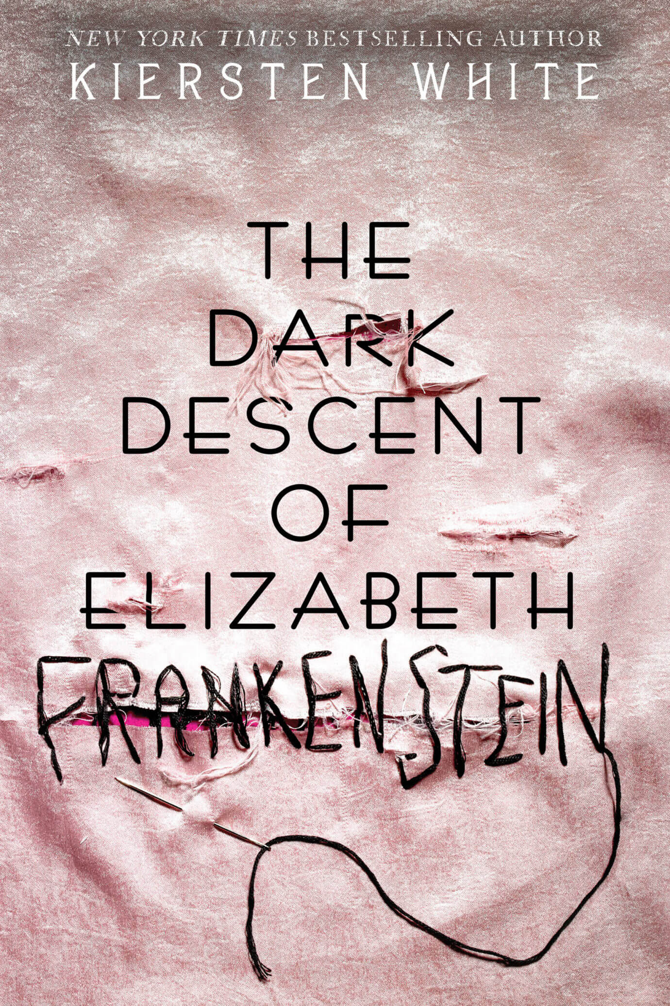
ICYMI, we recently revealed the cover of our new book obsession The Dark Descent of Elizabeth Frankenstein by Kiersten White in this video that broke the internet with its awesomeness:
We can’t stop talking about this book or this cover, so we asked superstar designer Regina Flath to answer some questions about how she created this masterpiece. Check out the Q&A!
1. When you first heard about The Dark Descent of Elizabeth Frankenstein, what excited you the most? Were you immediately inspired?
I was DEFINITELY inspired immediately! First off, I’m a huge Frankenstein fan, and a gothic-horror fan in general. The idea of a retelling from a female perspective totally intrigued me. My brain spiraled off in a thousand directions, but once I started to read, I narrowed myself down to distinct approaches I could take to make this cover successful.
2. What research did you do?
I did a ton of research on the various ways the story has been depicted over time: adult book covers, movies, spoofs, fan art, posters, and more. I wanted to get a sense of how we collectively see Frankenstein.
I wanted to get a sense of how we collectively see Frankenstein.
I wanted to find images that would immediately call the story to mind, regardless of what we did with the title. That research led me to the idea of the stitches as a shorthand for Frankenstein. I also thought a lot about how, in my job as a designer, I’m often tasked to “Frankenstein” together images, and this idea of stitching two things together that might not quite fit helped push the concept forward for me.
3. How long does it take you (in hours) to create the perfect cover?
That really depends on the project! Some projects fly through with minimal feedback and art processing time, so they probably take about twenty to forty hours total. Others can take hundreds of hours, spanning the course of several months!
4. What is your favorite part of the process?
My favorite part of the design process is definitely the initial brainstorming. That’s when the sky is the limit and any idea is a good idea as you begin to explore what’s possible, what’s cool, and what’s interesting.
5. How many iterations of the cover did you go through before coming to the final version?
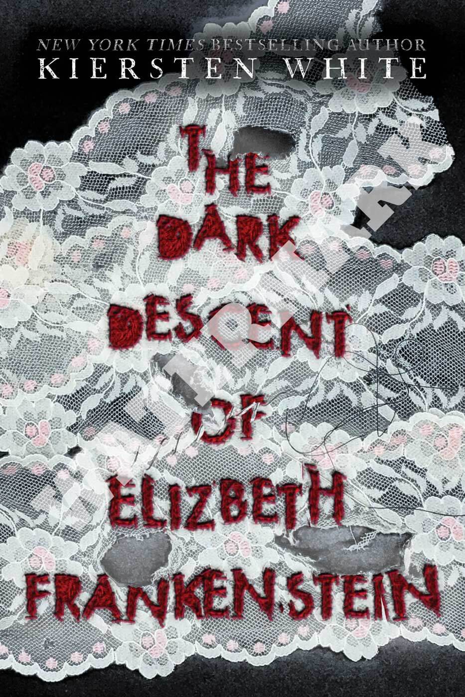
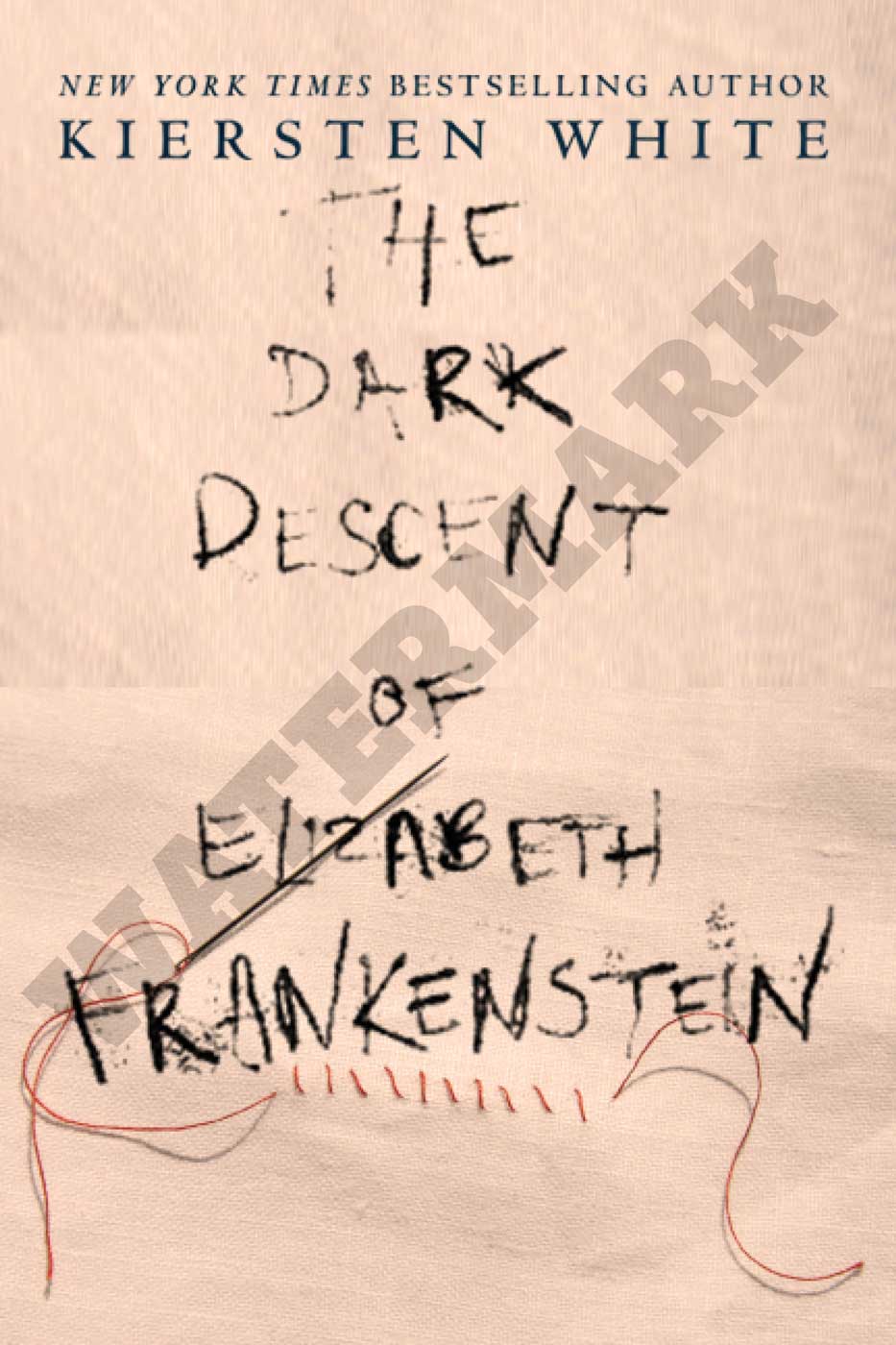
I made about twelve distinctly different concepts before I narrowed it down to what the final cover would end up being.
Check out these editions of the cover before the final:
6. What did you use to build the cover?
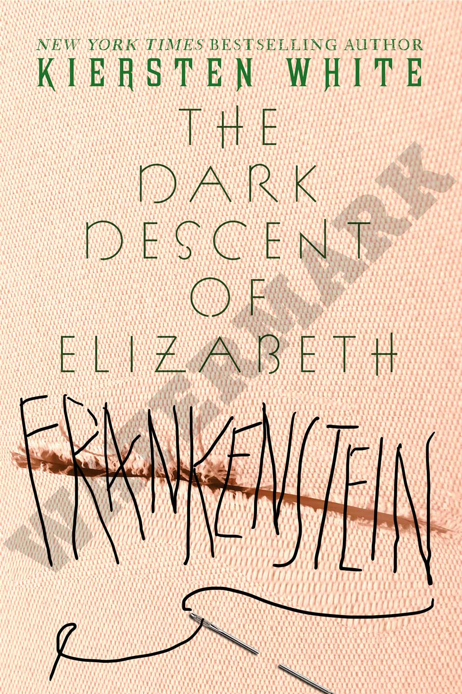
I was tremendously hands-on for this cover in a way I don’t normally get to be. I purchased several different fabrics, a few embroidery hoops, needles, and embroidery floss. Then I did an initial embroidery of the cover so we’d have something to shoot as soon as I got to the photo studio. (The cover was shot by fabulous photographer Christine Blackburne!) While at the studio, I embroidered three more versions. The final cover image is actually the very first version I did, which is interesting to me.
I wanted the stitching to feel rough and unskilled...
I wanted the stitching to feel rough and unskilled, which I easily pulled off at the beginning since I am NOT a proficient embroiderer. But I think all the practice refined the stitches too much in later versions. That first version was exactly what we needed! As we shot, Christine did some distressing on the fabrics, including using “I can’t believe it’s not blood!” fake blood on it, which just charms my goth girl soul. Once the photos were sent to me, I put them together in Photoshop to get an idea of what I needed for the final cover and sent the image back to Christine for retouching. Then everything came back to me to be assembled in InDesign for the jacket mechanical!
7. What is your advice for an aspiring cover designer?
Work hard! My advice for any creative professional is to remember that “hustle beats talent if talent can’t hustle.” You may be the most talented artist or designer in the world, but if you don’t work hard and get yourself out there, you’re not going to go far. Always make sure you act with professionalism and respect when dealing with others, and seek out cover designers you admire for advice and guidance. (If you don’t know any, find me anywhere on the internet at @reginaflath!) And keep reading. If you love reading and you love design, then designing book covers is a very rewarding career. I’m so glad I chose a career where my “homework” is to read fantastic books!
HERE IS THE FINAL COVER!
