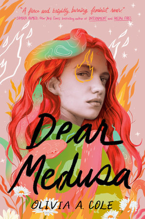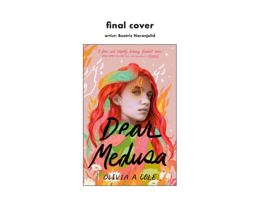
Ever wonder what goes into the making of a beautiful book cover? We asked our cover designer Casey Moses to share her behind-the-scenes process in creating the gorgeous book cover for Dear Medusa by Olivia A. Cole. Keep scrolling to see early sketches and discover how it all came together.
Introduce yourself!
Hello! My name is Casey Moses, and I am a senior designer on the YA cover team at Random House Children’s Books!
What does a book designer do?
We are responsible for creating memorable book packages that represent the story while enticing readers. Designers take in all the available information and figure out how that translates into a visual. There’s brainstorming, looking at trends, trying new things, and creative problem solving. For most book covers, we collaborate with illustrators and photographers. We provide them with creative direction to help execute a concept, and we give feedback for revisions based on communication about our goals with the rest of the team: the author, editorial, sales, marketing, publicity, etc. We design with a clear hierarchy and ensure the image and typography are cohesive, and we pay extra attention to details to make our books look their best, both online and in print.
How do you approach designing a cover? Do you do research?
I always start by reading the materials our editorial team provides. The editor for Dear Medusa, Liesa Abrams, put together a comprehensive brief with all the most important information I needed to start the cover, from the title to similar books in this genre and any notes from the author. I also read the manuscript and noted any potential visuals and concepts—I love making mood boards for inspiration. Sometimes I sketch out rough thumbnails of different ideas, and I’m always keeping my eyes out for potential artists to share with the rest of the team as I scroll Instagram. We like to go in a few different directions and discuss what might work best for the book—there are a lot of meetings!
What inspired the final cover of Dear Medusa?
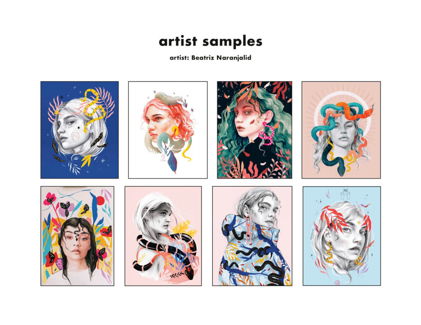
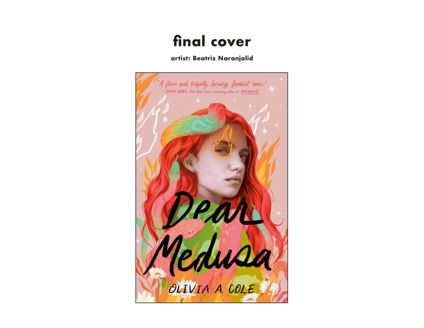
Medusa is so integral to this story; we knew we wanted to include snake imagery on this cover. We had to be careful that it didn’t lean into the fantasy genre, where snakes are more prevalent. I immediately thought of the artist Beatriz Naranjalidad, whose work is so gorgeous. She incorporates snakes and figures into her art in such an organic way with a raw and emotional tone. She felt like the perfect illustrator for this cover!
How many iterations of the cover did you go through before coming to the final version?
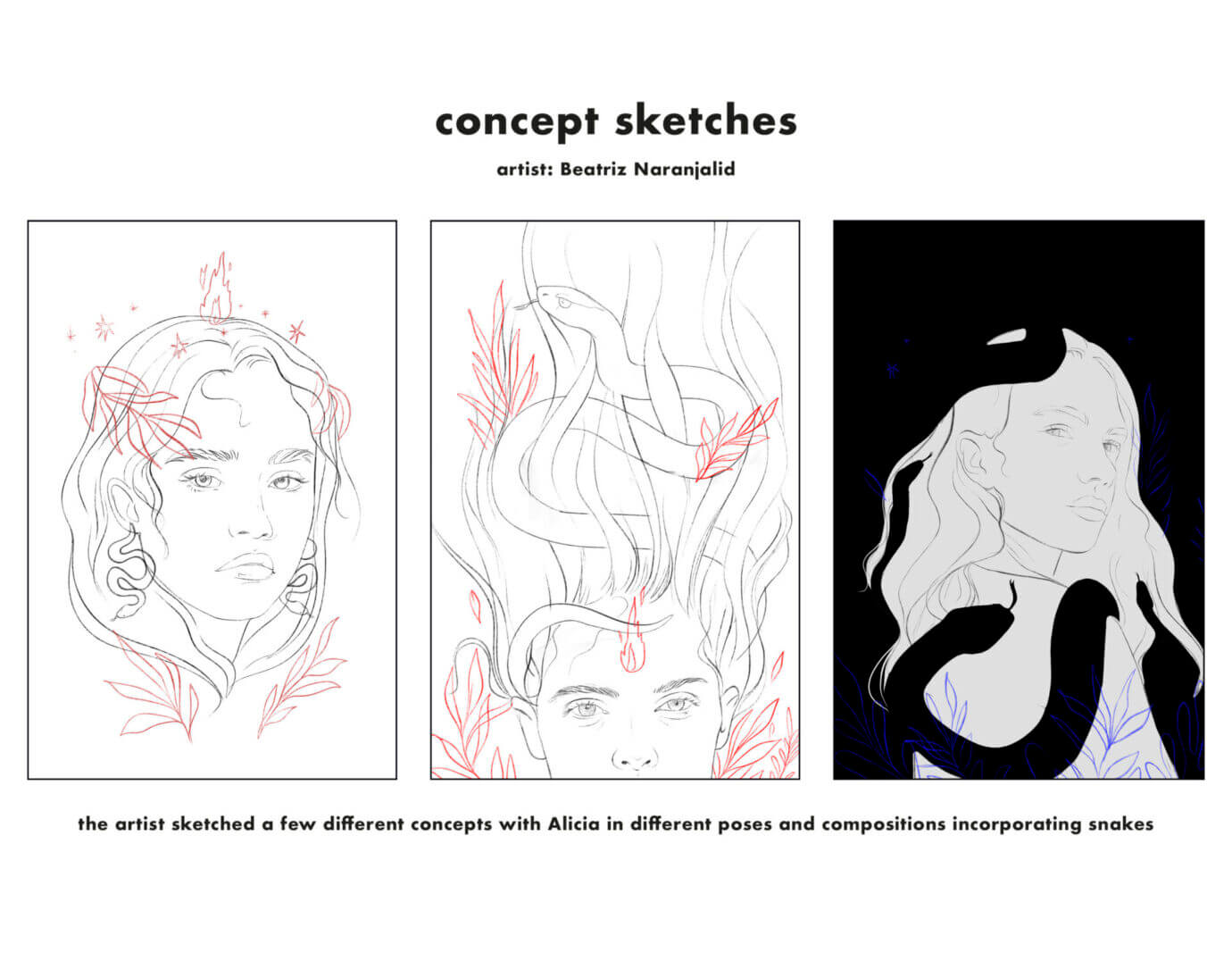
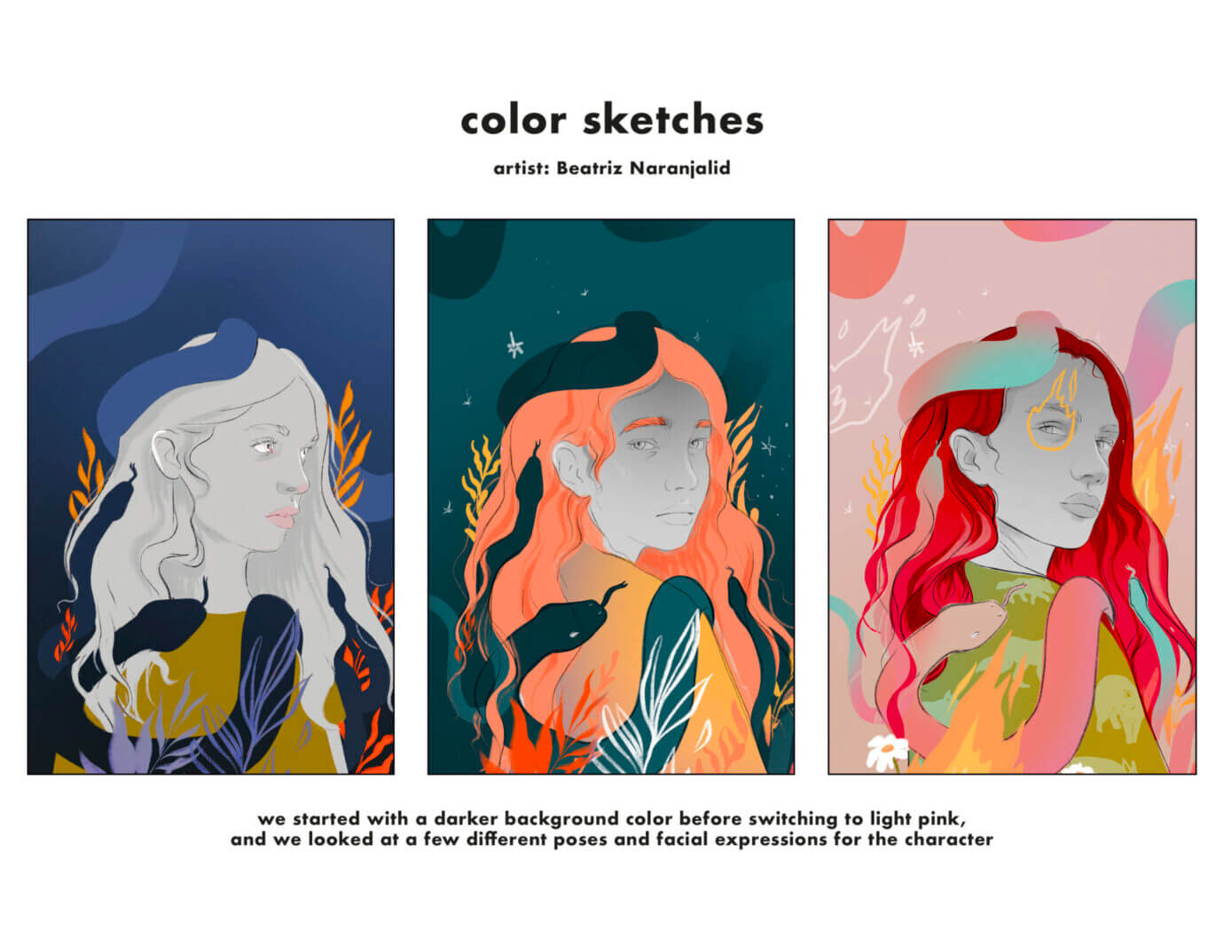
As you can see from the process images we have to share, a book cover goes through many stages. We wanted to feature the main character, Alicia, on the cover, so Beatriz started sketching a few different concepts incorporating snake imagery and the girl. From there we narrowed down to our favorite option, and I sent feedback so she could revise and keep developing a color sketch stage. We looked at Alicia in a few poses and different color palettes. You can see we originally went down a darker color path with a lot of blue tones before landing on a brighter, bolder palette that we hoped would stand out on the shelf. Toward the end, we really focused in on the details, adding in more symbolism from the book with the flames and the wolves. The artist also worked hard to capture the right expression for Alicia. To encompass the multitudes of this character. We wanted her to be fierce but still have a weariness about her in the eyes, and Beatriz is an artist who expresses emotion so beautifully—we think she nailed it!
What’s your favorite part of the process?
I love the beginning of the design process when there’s something new to work on and the possibilities seem endless, but nothing beats the finished books going out into the world. Watching authors unbox their copies and hold this piece of art they’ve worked so hard on, and seeing readers find the book that becomes one of their new favorites is the best part!
Any advice for aspiring cover designers?
If you want to design book covers, self-initiate some projects for your portfolio! Reinterpret some of your favorite book covers in your own style. Experiment with taking one book in a genre like romance and make it look like a fantasy novel, or make up a book you wish existed. Go to the library or bookstore and study all the different elements of a cover design and book jacket and incorporate those pieces into your work.
Any final thoughts?
I urge you to check out Beatriz’s art and follow her on Instagram: @naranjalid. She’s always posting fresh and inspiring work!
